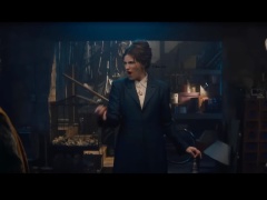
From its angrily ornate title cards to its icily appointed doom house of crowns, the art and design elements of “Beef” — Netflix’s 10-episode series from creator Lee Sung Jin — provide the bleak road rage dramedy with a subtle brand of ardent aggression to match its one-upmanship revenge fantasy. The tactile, class-conscious aesthetic of haves (Ali Wong’s Amy) and have-nots (Steven Yeun’s Danny), created by production designer Grace Yun and art director Michael Hersey, pursue a metaphorical vision.
Here, curated paintings, sculptures and furnishings — in gallery and home settings — are equitable to the mood swings of its principal characters.
“The characters are real and complex. The rage coming from Amy and Danny was so well-written, and before I even read the first episode Sonny [Lee Sung Jin’s nickname] sent me an idea for the character art,” Yun told PvNew. “I knew where I wanted its look to go.”
Matching the hyperactive road rage vibes and vicious revenge tricks of “Beef” to its physical ideation of art, sculpture and room design came down to each character’s psychology — “Where they were in life,” said Yun. “The outward presentation of self, with Amy, is about success and perfect curation, and yet her inner-self is in turmoil and chaotic. Danny’s outward presentation is of struggling to make ends meet and goal attainment with so much of a non-starter personality.”
Their initial vehicular rage encounter in the first episode unleashes a genie-in-a-bottle brand of anger that could not be resealed, especially when you consider the drive to define each character’s ride: “Amy’s shiny white Mercedes SUV and the battered, oxidization of paint we had to add onto Danny’s old truck,” Hersey says.
Jin, Yun and Hersey also considered the radical differences in living environments, what the production designer called “the visual anchors” of Danny and Amy’s homes. “Danny’s space was drawn from Sonny’s memories of his first apartment,” noted Yun. Hersey went on to discuss the bump-outs and the handyman aspects of Danny’s one-bedroom space with unfinished walls, bent nail heads and trimmed 2×4 planks. “We wanted to highlight the learning-on-the-fly aspects of his job and its how-to imperfections,” laughed Hersey. The complete opposite, however, was true of Amy and husband-sculptor George’s (Joseph Lee) manicured home.

While Amy’s domicile telegraphed success and drew greatly from mid-century architectural influences (“All of the windows wouldn’t face or expose any sky,” stated Yun) with contiguous spaces on its first floor, the most telling aspect of the couple’s shared home is how off-and-away-in-a-corner George’s studio is, and how it was “allowed” to be messy.
“Amy made all of these curated choices in their home, so the one room that is not is George’s artist space,” said Yun of the vast but claustrophobic floor plan. “This signals how Amy has created her own cage, a prison with wall textures reminiscent of concrete… while George’s space is freer.”

That freedom figures, too, into George’s sculptures — globular, amorphously-shaped works, crafted in-house with lead sculptor J. Bryan Holloway, and representative of how Amy’s husband interacts with the world, without a care, as well as the aesthetic difference between the two. “Amy is all rectangular lines, minimalism and Scandinavian-Japanese influence, and George’s sculptures are rough, blobby and organic-feeling with many layers and colors, referenced by ceramic artists such as Ken Price… even Seth Rogen with his use of specialty glazes,” said Yun. “I also found this great chart of abstract yoga poses to base George’s sculptures on as a metaphor for George’s free-flowing positivity towards life…. with its alchemy of beautiful colors and iridescence.” In later episodes, as George’s art matures and his vases and sculptures grow larger, they were given what Hersey called “finishes reminiscent of a patina you might see on metal, a charred finish beyond his usual rainbow aesthetic, into something darker.”

Balanced against George’s failure to sell as a sculptor is the mega-success of his legendary artist father, and its resulting “65 Chair Exhibit” featuring the elder’s “classic” smooth sculptural Tamago chair.
based upon Isamu Noguchi’s mid-century “Burden Chair,” Yun and Jin discussed a three-legged chair with a stone-like, egg-shaped design. “Our assistant director took a stab at it but was uncomfortable with all of the chair’s compound curves,” said Hersey. “One of the funniest notes we had was to enhance the butt indentation, modeled after his mother’s butt. We carved the Tamago chair out of hard foam with an embedded steel frame like an inner skeleton, then coated in fiberglass — like a surfboard.”

For all the lengthy discourse on Amy, George and Danny’s aesthetic decisions regarding space and craft, there is also the visual smorgasbord of Jordan’s house, the gloomy, shelter-like mansion with its collection of rare crowns (pieces sourced from area prop houses selected to not look sci-fi or Eurocentric) owned by Amy’s multi-billion-dollar employer-mentor played by Maria Bello. “The theme of appropriation was important to Sonny when it came to Bello’s character and her so-called ownership of Peruvian and Asian-seeming crowns,” stated Yun.

“And the location we used was a religious space, House of the Book, on a hillside in Brandeis, and we had to cover up all of their totems and library shelves in a tactile fashion,” said Hersey.
To Jordan’s holy prison-like home design, Yun added vertical concrete, Joshua trees, aged bronze patina, an epic mural of bloody battle images stitched together from war paintings found in the Library of Congress, and a crow for that extra touch of impending doom necessary for one of “Beef’s” closing scenes. “We were given the directive of ‘death,’” laughed Yun, when it came to Jordan’s space. “Even more so than Amy’s space, Jordan’s house and furnishings were meant to look and feel exclusive, and not at all welcoming.”


