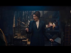
When production designer Cabot McMullen first started thinking about designing the therapist’s practice that is the heart of AppleTV+s “Shrinking,” Harrison Ford had not yet been cast.
Phil’s character was based on a real-life therapist, Phil Stutz, the subject of Jonah Hill’s recent documentary “Stutz.” But when it was announced that Ford would play the lead, Phil became Paul.
As for his designs, McMullen worked closely with the actors to develop a design strategy for each office with character-driven representation through artwork, books, color palettes and desktop details. Many of the desktop items were personally chosen or curated by the actors.
Running the gamut of appealing personalities, the ensemble is made up of Ford as Paul, a charming, yet grumpy man. Jason Segel is Jimmy — a man riddled with guilt, grieving the loss of his wife while trying to be a cool dad to his teenage daughter, and Jessica Williams is Gaby, a fellow therapist coming out of her failing marriage.
While the first three episodes of the series established Paul and Jimmy’s offices, the most recent gave audiences a deeper look into Gaby’s office.
Here McMullen breaks down the ideas behind the offices.
Paul’s Office

“We saw him as a bit of an enigma, and so we referenced (the book) ‘Fifty Shrinks.’
“It’s about New York therapists and the commentary that each therapist gives about the choices that they made in their offices was fascinating, some are very intentional and some are not. Others are meant to misdirect the patient into a zone where they’re more accessible.
“In Paul’s case, he has Carl Jung references and there’s artwork. He is well traveled and has a diverse collection of antiques, but if you look around the room, there’s nothing personal in there and you can’t get a read on anything.
“When Harrison came in, he’s a very physical actor who feeds off his surroundings and counts on props, set dressing and production design to fuel his process. So, he came in and said, ‘I need a chair with arms because of his character’s Parkinson’s disease. He started showing us where he needed pieces of furniture so he could do push-ups and exercise. He even wanted a bike in there, as he thought Paul would be a cycling enthusiast.”
Jimmy’s Office

“We started looking at Jimmy first. We felt if we found his house, then we had the hub of our wheel and we could start to plan out how the company moved based on that because Jimmy is at the center of the show. The story is about a man who is emerging from the darkness. In the beginning, if you look closely, all the drapes are drawn in his house. They’re also mostly drawn in his office.
“We wanted to keep him in somewhat darker tones. The paint and fabrics for Jimmy were dialled down. We took it as far as the greens in his office. Jimmy, when we meet him is neglecting his house, his daughter and his plants. All his plants are dying. So, you’ll notice everything in there is wilted and not doing well.
“As a designer, I try to tell you something about the characters that the script can’t tell you with words.”
Gaby’s Office

“Gaby is the life of the party. She’s the lively one, a big personality, and it’s expressed in her office. For her, we brought in a lot of colorful fabrics and more contemporary furnishings.
“She’s in a mid-century kind of envelope but all of her stuff is modern in contrast to her colleagues.”


